

Tips on Logo Design and Tutorials
Subway New Logo Before and After
Best Pixel logos 2023
3D logo 3d logo design logos pixel logo pixel logo design pixel logos pixels
Exclusive logo or Non Exclusive logo, what's the Difference?
customize logo Exclusive logos non exclusive logos

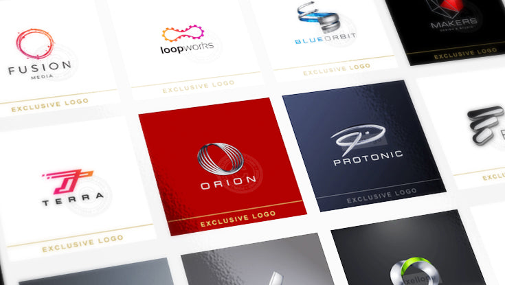 Exclusive or Non Exclusive logo, whats the difference? We admit, if its your first time hearing this term, you are not sure what it means and thats ok, we will explain difference in detail.
Update and Modernize your Logo design

 All logos get outdated, type, colors, design lines change all the time and if your company always trying to keep up with times with their technology, process, machinery, even philosophy, that means the image of the company has to reflect and give the right message, just look at the Apple logo Evolution throughout the years, can you imagine their first logo on any of your apple devices? The simple answer is, hell no!
16 Crazy Ads You Won't Believe They Were Run.

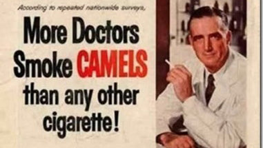
Here is a quick look back of how outrageous, controversial, sexist and utterly irresponsible print ads use to be, no need to dust off your time machine, we have collected 16 of them here for you to see. Just when you thought you are desensitized enough by todays political climate that you think you cant be shocked anymore...