Little Sun is an initiative of Danish-Icelandic artist Olafur Eliasson that aims to bring light into people's homes. The product consists of a led lamp in the shape of -you guessed it- a little sun that looks forward to help communities in development. Wolff Olins was the chosen agency to be in charge of the branding process of the product and given their portfolio they did not disappoint. They came up with a beautiful corporate image that matches up the spirit of the project, it stands up for brilliant design with a playful touch.
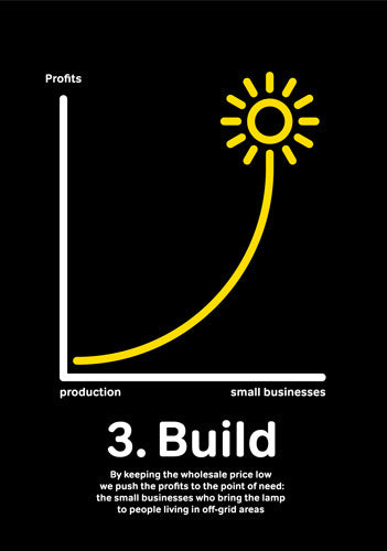
As for the logo, they went for the common place of clean rounded strokes and using just the minimum. The shape of the sun is replicated and used as the common element throughout the applications of the brand, making it the true protagonist- both logo and product. Bright yellow over white and black is the constant color combination, a strong contrast that will certainly draw attention to the product besides being consistent with the main focus of it all: light. I specially love how they use the logotype as an adaptable icon for other representations, as is in the case of the chart. It's definitely a beautiful branding case that matches up to the product they're showcasing- beautiful inspiration of how something so simple can be turned into a strong identity case.


