Every once in a while you come across some amazing work that's really mesmerizing and make you go "how did they do that?" . Well, in this case, Channel4 took on the project of re-designing their branch More4 and for this task they asked for their in-house agency, ManvsMachine to come up with new ideas. The result was a fresh and colourful logo that looks well in print as in their programming.

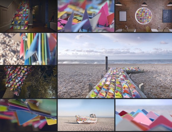
Then, once ready with the overall design, they got the Jason Bruges Studio to take their brand update to the next level. The Jason Bruges Studio specializes in innovative installations and presentations, and with this project they really took it to the next level. As it says on their website, they had about a month to put everything together and for their huge production they had help from the Middlesex University. They took the square units that fold and change colours and transformed them in visual machinery: circuits, folds, wiring, and so on and on. With all this complex production, things couldn't fall short, and as expected the results are amazing, 4 locations, indoor and outdoors were used to display their work and here you can see the results.
MvsM / More4 Idents – Making Of from ManvsMachine on Vimeo.
Images credit: ManvsMachine

