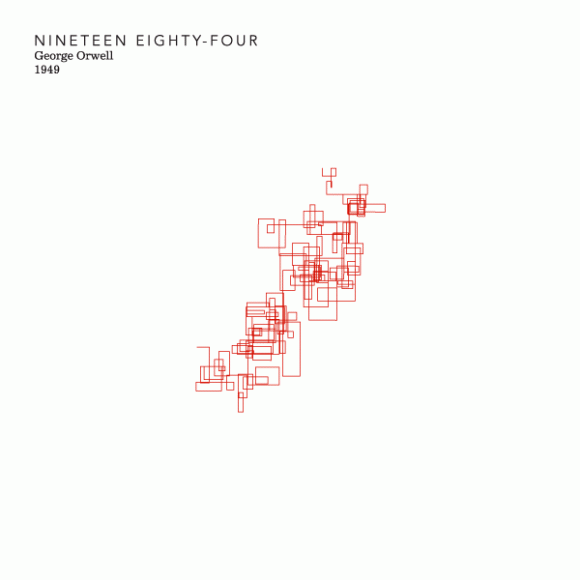
Stefanie Posavec is a London based graphic designer with a fascination of everything editorial. Her work varies from book covers, music album covers and editorial design, but what struck me the most are her infographics that dissect books from different authors. The amount of work put into this project is unbelievable since it translates all the elements of each book into a visual form, that is from words/sentences/chapters/etc. Her approach to this (actual) investigation comes in two different forms, one that she calls Literary Organism patterns and Sentence Drawings, both to showcase the different style from each author. Sentence Drawings is particularly beautiful, it represents the first chapter of each book using very simple lines that evolve into different paths according to the length of each one of them.
For the First Chapter diagrams, I attempted to create a system that could easily represent differences in writing style between authors. I used the number of words per sentence to generate drawings of the first chapters of various modern classics: the more tightly wound the drawing means a shorter, choppier flow of sentences was used, while a larger drawing represents a writing style that utilises long, flowing sentences.


 As for the Literary Organisms, Posavec worked with the structure of Part One of the book On the Road visualised using a simple tree structure that has been worked with manually in order to give it a more organic feel. Here, Part One divides into chapters, chapters divide into paragraphs, paragraphs divide into sentences, and sentences divide into words. Everything is colour-coded according to key themes in On the Road.
For both topics she made a book edition to showcase the details of her work, I wish I could get my hands on them.. this work is absolutely brilliant.


