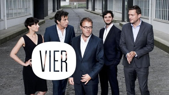
As a part of their re-launch campaign Belgian TV channel TV4 got a whole new re-branding process to consolidate their appearance as the new broadcasting channel VIER. London based agency Why Not Associates is the creative power behind the brand and they've opted for a very trendy look that relies on a very minimalistic use of graphic resources and a vintage inspired aesthetic.
These images are the sneak peek before the channel's launch next September and although they might not be the actual graphics that are going to be displayed, they give us a pretty good idea of the feel they're trying to portray. The shape of the new logo resembles the TV screens of the 60's which is accompanied by a very simple sans serif font that reinforces this sober look. Vier wants to position itself as a a channel that is "at the same time very new and very familiar" and "exclusive to everyone", thus the juxtaposition of old pictures and the new logo- an interesting mix that certainly fits into the current design trends.


