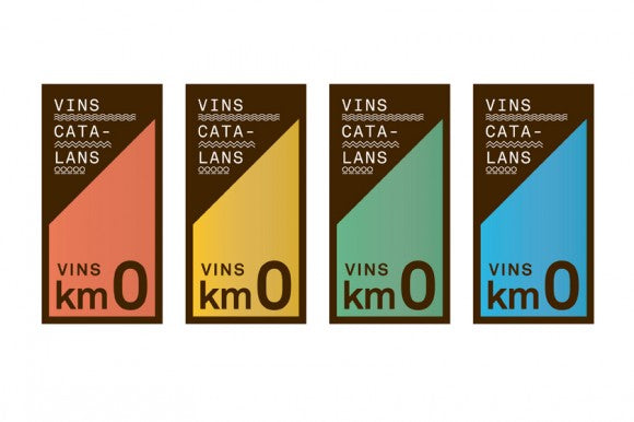
Catalan agency Toormix has delivered an impressive branding project, "Catalan Wines" which aims to promote said product for domestic and international audience. Wine labels have always been a niche of freedom for graphic designers, thus making it imperative to have one that makes an impression. And for this case, they went all the way by combining beautiful design with a very strong conceptual base.
The identity has been built over a theoric base that dissects the associated data to wine production. This way, they're connecting the characteristics of wine with visualizations, all of this incorporated into the graphic design aspect. Different patterns were then drawn in a minimalistic style, thus conforming a consistent look throughout all the different branches. These are later used as the essential units combined to create the specific labels.
Besides of the basic iconography of the brand there's another conceptual dimension added: cartography. They've included the regional areas as part of the visual identity of the brand, using them as a link between the wines and Catalonia. And if that wasn't enough, the color palette chosen for this project gives it a very modern and approachable look- they certainly thought of everything! The applications of all these elements certainly create an outstanding look, with the use of complex geometrical illustrations matched with light and modern typefaces.
Such carefully thought and perfectly executed corporate identity is a great inspiration for other designers, showing that a strong conceptual background will most likely deliver pretty awesome results.


