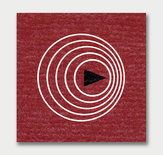
It's always important to look back of where graphic design comes from. In its early stages it must've been pretty awesome to experiment on different printing methods, composition styles and illustrations, and as we know there have been a lot of changes throughout the times. We've already seen some examples of vintage covers and I think they're a great example of the basis of editorial and graphic design. The 1960's Life Science book covers are a perfect demonstration of how the times changed, and how different the style was back then..and most importantly how that has influenced our current work as designers (you might even see how this style reflects in today's retro trends). I love how these covers play with the front and back as different versions of the same topic, the front taking the direct interpretation using a photograph as the back has a more minimalistic, abstract illustration referring to the cover (another current and popular trend). Well and now for the pictures, 100% 1960's graphic style:


