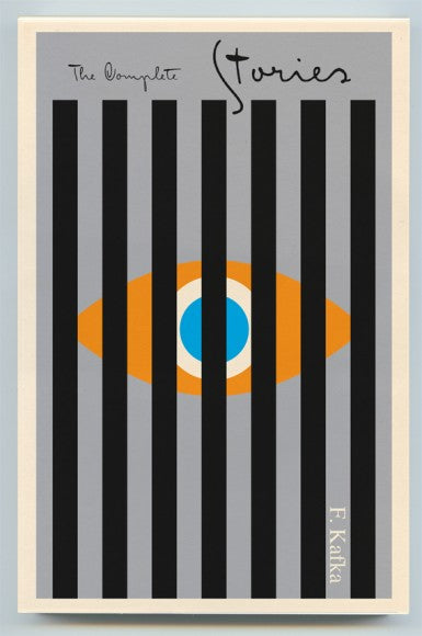
Peter Mendelsund is a graphic designer and illustrator that has a lot of interesting work when it comes to book covers. His pieces are very eye-catching and bold, making each and every one of them a statement when it comes to presenting a book to the world. Not only does he illustrate the covers, but he also gets the books and what their look should be like, thus creating potent and attractive looking editions that just make sense- and this is the case with Simone de Beauvoir late works. You can read his thoughts on this project in his blog.

The covers are inspired on the protest signs that covered Paris in the 60's, a mix of irreverence and bold statements. They have an organic feel and definitely make a statement; the style of the hand-written titles with the pop-art looking illustrations relate closely to the philosophy behind de Beauvoir's work. Mendelsund explains it as follows:
I wanted a style that had a certain directness—and I liked the idea of co-opting the visual language of revolution for a writer who was nothing if not (philosophically, politically) revolutionary. Also the style is more or less temporally and geographically correct. The simplicity of the style made it possible for me, with my limited skills, to make them myself.


Via