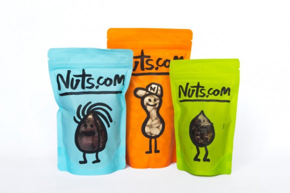
Nuts.com is a family business that's been around since the 1920's. They took their grandfather's business into the online world and started selling the products via internet and recently they went through a makeover made by world renowned agency Pentagram. Their brand focuses on the quality of their products without losing the approachable appeal and for that their new corporate image they went for a playful look that fits into the current trend of organic foods.
To portray their products as family-friendly and attractive, the brand includes a series of doodle-like characters and a customized handwritten typeface that offers variations to each letter as a way to reinforce the concept of everything hand-made. Their logo is kept to its simplest form by using just the name in this handwritten font. The packaging also relies on the use of bright colors and the bold strokes that compose the cartoons and texts. This elements give the brand a more approachable look that reinforces their hand-made organic products as well as an attractive look to stand out among their competitors. Their website also follows the same guidelines by using muted colors that evoke a vintage look. This is a very cool example of simple design that portrays a playful look with the minimal elements, a beautiful inspiration for graphic designers that are looking for a fresh input on branding.


