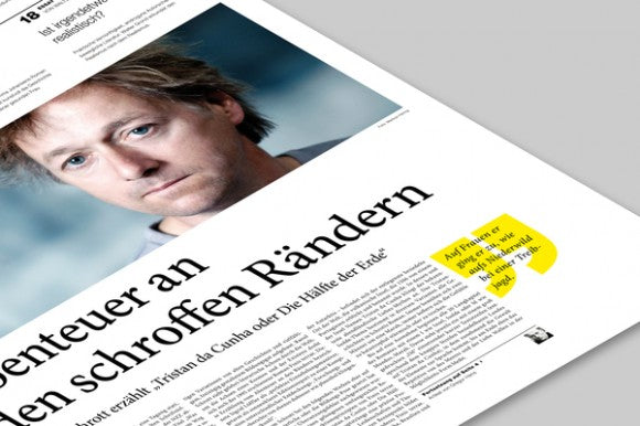
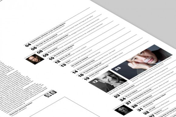
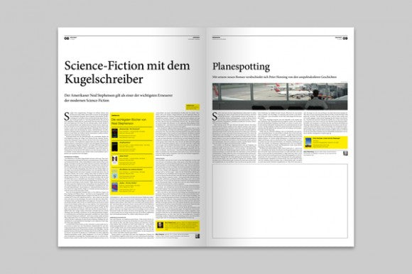
As part of a semester project for their diploma at the FH Aachen, University of Applied Sciences, Jann de Vries and Stefan Zimmerman created the corporate identity and editorial design for VOLLTEXT, a German literature magazine. Given the character of the edition they went for a minimalistic look that takes traditional newspaper-like layouts but with modern elements thrown into it. Keeping the logo to a minimum, it consists of the title in a bold sans serif typeface without any other elements added to it. It manages to create a strong impression as it contrasts the more sober layout which takes ques from classic newspaper style.
The layout uses a lot of blank space to give a more sophisticated look and really makes the texts stand out. The titles and the different elements that compose the page combine bold sans serif typeface with thin lined ones that at the same time contrast with the serif font for the texts and their respective titles. Other elements such as the divisor lines are adjusted to a 3 column grid that really enhances the use of blank space, same with the photographs used- they adjust to the width of the grid and maintain this structure throughout the entire edition giving it a consistent look. A bright yellow is used to highlight paragraphs and differentiate quotes as a way to break the monotony of black and white print and to pop out in a very modern manner; a thoughtful set of details that really takes this magazine out of the conventional. Beautiful work and inspiration for editorial designers.


