It's a given for every food related business that their corporate image must be spot on for success. The rise of the slow-food movement and the overall preference for hand-made and organic meals also plays a part in the direction of the visual aspect of their products. Pasta La Vista is an Italian chain of restaurants and also a pasta manufacturer that has taken these cues into consideration for their brand and Andrew Gorkovenko is the designer behind it.

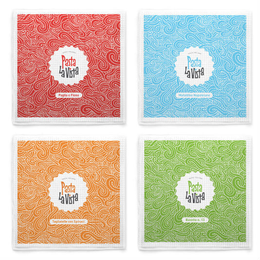
The look he went for is playful and colorful, giving the brand a youthful and approachable character that is also reflected on their products. The logo and its applications have this organic feel, where the typefaces combined reflect this upscale character (the use of geometric sans-serif fonts) with the laid back aspect of the typographic design of their name. The logo is then implemented onto the elements of the brand and the restaurant, achieving a consistent look. The use of intricate patterns is a nice touch that reinforces their organic feel, making it stand out because of its uniqueness and presence. Such is the case of their stationery and napkins, where fine white lines against different colored backgrounds compose a beautiful wavy pattern that contrasts the logo stamp in white.

Vibrant hues were chosen for the variations of the logo for their products- another impressive display of their brand! The packaging itself is very original and plays with 4 different characters -accordingly to their different kinds of pasta- referencing their Italian heritage. All in all is a beautiful display of brand and packaging design!


