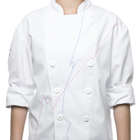
Therurel & Thomas is a french style patisserie specialized in macaroons, those beautiful and delicious pastries that make mouths water. Anagrama is the studio in charge of their visual identity that focuses on a classic french look, all white with elegant little details that reflect the spirit of the brand. The corporate design that they created emphasizes on this upscale style and delicacy that are these desserts.
The use of limited colours against a pure white background reflects the elegant feel that the brand wants to project. The interior design follows this style and makes quite an impression, all of the pristine elements clash with the vibrant colours of the macaroons, making the product the main focus in the room. As for the visual aspect of the brand, they combine serif font with delicate ornaments and fine strokes of colour which are also seen in other elements such as the aprons (how thoughtful is that?) and packaging. Overall it's amazing work and will surely encourage people to go try some macaroons!


