Important Note: This project was not commissioned by Nike Inc.
Nike's logo is probably the most recognizable icon out there; Nike's logo recognizability is unparalleled when it comes to sports brands. The icon is so perfect that we doubt that anytime in the future it will be changed. Almost all logos go through changes and enhancement, but not Nike's logo. The Typography changes depending on the brand's needs, but not the Nike swoosh icon. It is as perfect and complete as it gets.
Since the Nike logo cannot be changed, we wanted to see our version or our vision of seeing Nike's logo. No, we were not asked or commissioned by Nike. This project is a study, an experiment, and a demonstration by us on creating a 3D version of a Nike logo.
Our first step was to see what was already created, we did a quick search on Google, and the results are mostly this type of flat Nike logo, extruded to look like 3D.


Important Note: This project was not commissioned by Nike Inc.
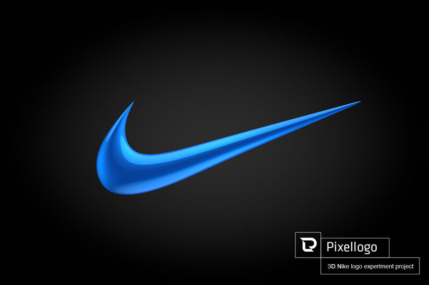
This render is high gloss electric blue. We kept the Studio lighting to a minimum only with as few reflective lights as possible to highlight the beautiful contour of the 3D Nike Logo. The only place there are sharp edges where the logo starts and ends. Everywhere else, it's smooth and polished to perfection. The final render looks like a piece of jewelry.


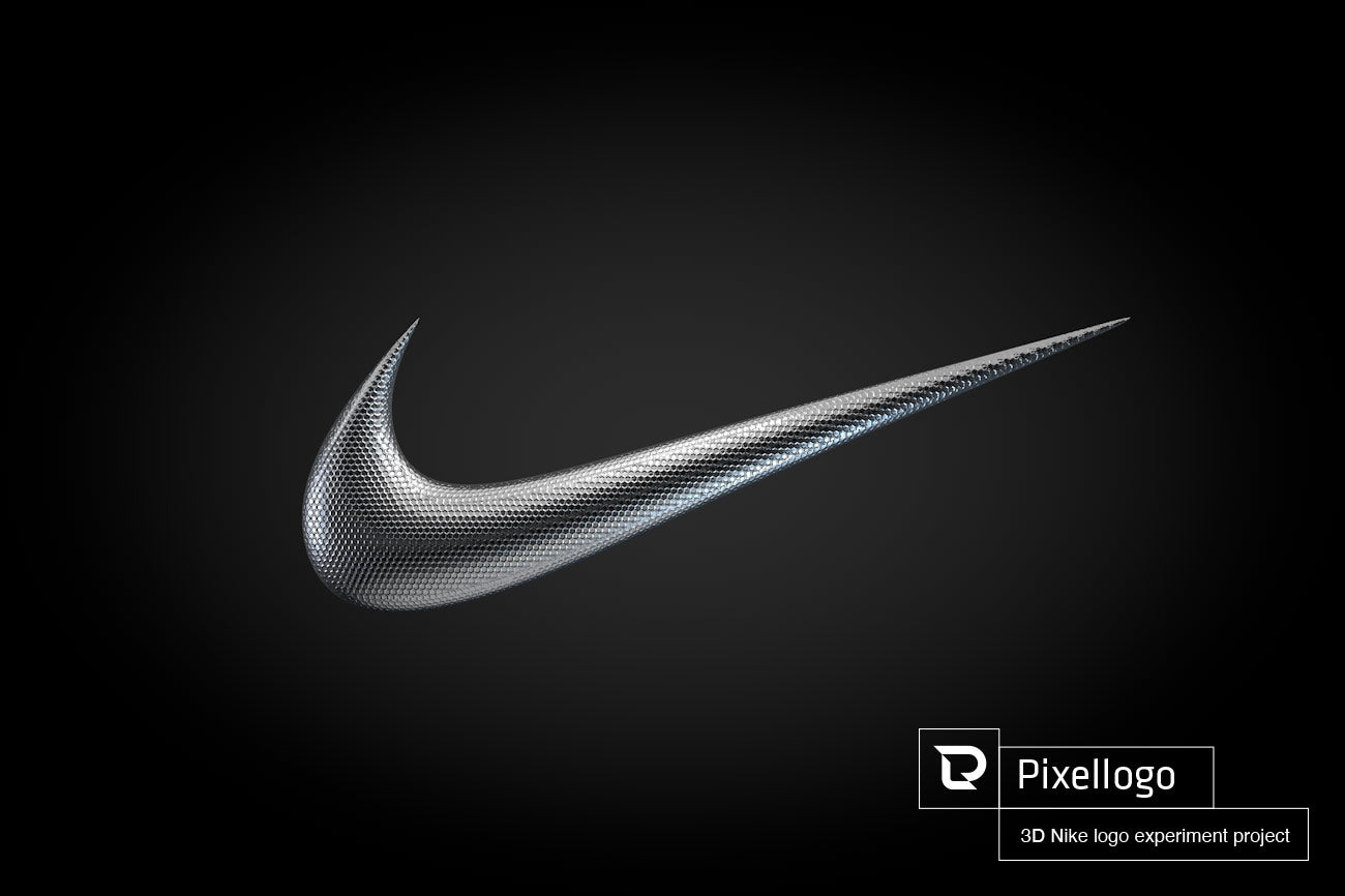
In these examples, we wanted to apply a bit of pattern as a texture. Nike uses all sorts of exciting and exotic colors, textures, and patterns, so we wanted to apply them to the 3D Nike logo to see what the results look like. The results looked maginificent.


Nike 3D logo

If you are looking to make your logo in 3D, please have have a look at our past projects and contact us.