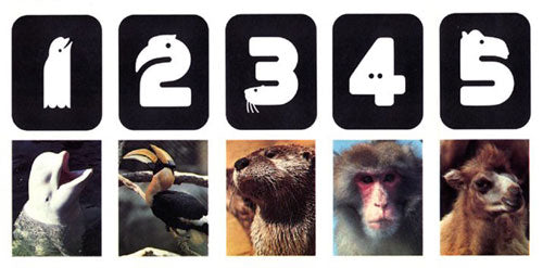
Lance Wyman is probably one of the biggest names in graphic design. The New Jersey born started his career with an industrial design degree, but soon enough his focus would shift towards logo design. This was back in the 1960's when design was just starting to arrive in American shores like an European trend, but it wasn't long until it picked up fast. Wyman was then on clear ground with a wide range of innovation work, coming up with some of the greatest pieces of its time; such as the Mexico Summer Olympic Games of 1968, a magnificent display of the modernist style.
His industrial design background has an evident influence in his graphic work which makes its unique and bold style. Built up from a minimalistic and geometric basis, his designs play with patterns and simple yet striking shapes as you can see throughout his work. He has been the man behind a lot of graphic design's most iconic pieces, such as the Mexico City's Metro visual identity or the Minnesota Zoo brand, two clear examples of his distinctive style. He mostly focuses on creating original but simple logotypes without compromising beauty.


