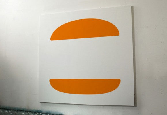
It's no surprise that logo design plays a fundamental role in brand recognition and most people today are able to tell what company's logo is in just a blink. Colors, geometric shapes and other sorts of combinations play the biggest role there, sometimes even overpowering the typographic work that displays the companies' name. This is the premise behind Dorothy's experiment called "You Took My Name", a series of large format logo abstractions of some very famous brands. Are you able to tell which one is which?
What this exposition shows is that basically, the key element in logo design is recognition. Sometimes it doesn't really matter the company name or what font you use as long as you have a strong logo that's able to stand by itself and still be completely recognizable. Another factor to take in consideration is that keeping it simple is also important to have a sustainable brand identity that can overcome design trends. These are things we have in mind when designing our logo templates, designs that allow you to give your company a boost at a low cost without compromising quality. Come check out our catalog, we'll be having some surprises coming our way pretty soon!


